Sep 7 - Dec 9 2021
Academic
Problem solving
Tara Jakubiec
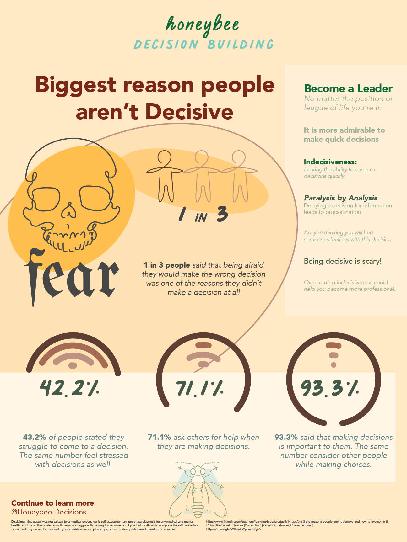
For our fourth year capstone we were tasked to identify what drove us crazy and to figure out how to solve this problem. While coming up with idea's I found myself caught between four ideas when I had an epiphany that the thing that bothered me the most was indecision.
With improved skills in decision making makes yourself more presentable with your professional career. It also gives you more confidence in your daily life.
With such a vast subject secondary research, discovered through existing studies and general searching wasn't going to be enough to narrow down the result. So a questionnaire was sent out to students to ask what stops them from making difficult choices.
Most of the results came from the graphic design students so I decided on focusing the project on decisions based on colours and design. I spent a lot of time learning about colour-psychology and cultural biases. As well as limitations such as colour-blindness or difficulties.
I can imagine I have only scratched the surface of a very complex and expansive subject that has elements of health, design and culture. With the knowledge I have learned in the amount of time I was given, I present Honeybee decision building.
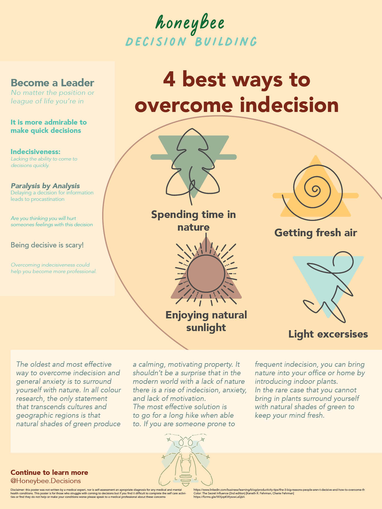
Enabling people with the skills to overcome indecision will help them become more confident and improve their life.
Give people the tools and pathways to make decisions quicker will give people more confidence in the workplace and their daily lives. Having the knowledge of mindfulness practices can also help as indecision can be the result of mental challenges. Finding the root cause can lead to a more positive life.
Young Canadians, 24 - 35
Graphic designers
Marketing agencies
Business owners
Playful
Positive
Encouraging
Marked by a prone to indecision:
Irresolute an indecisive state of mind
Not being decisive:
Inconclusive an indecision battle
Not clearly marked out:
Indefinite
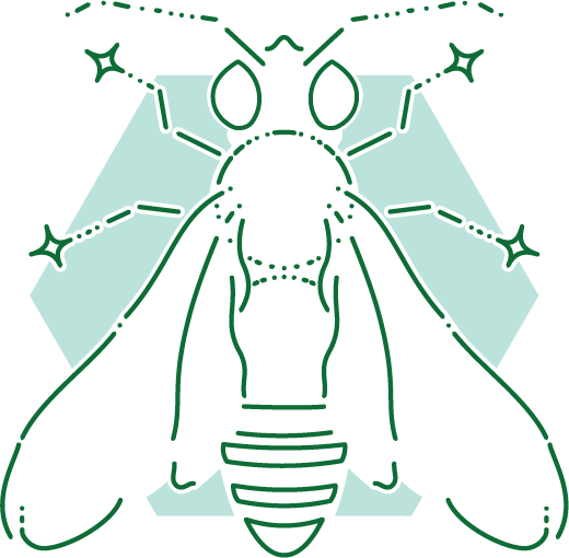
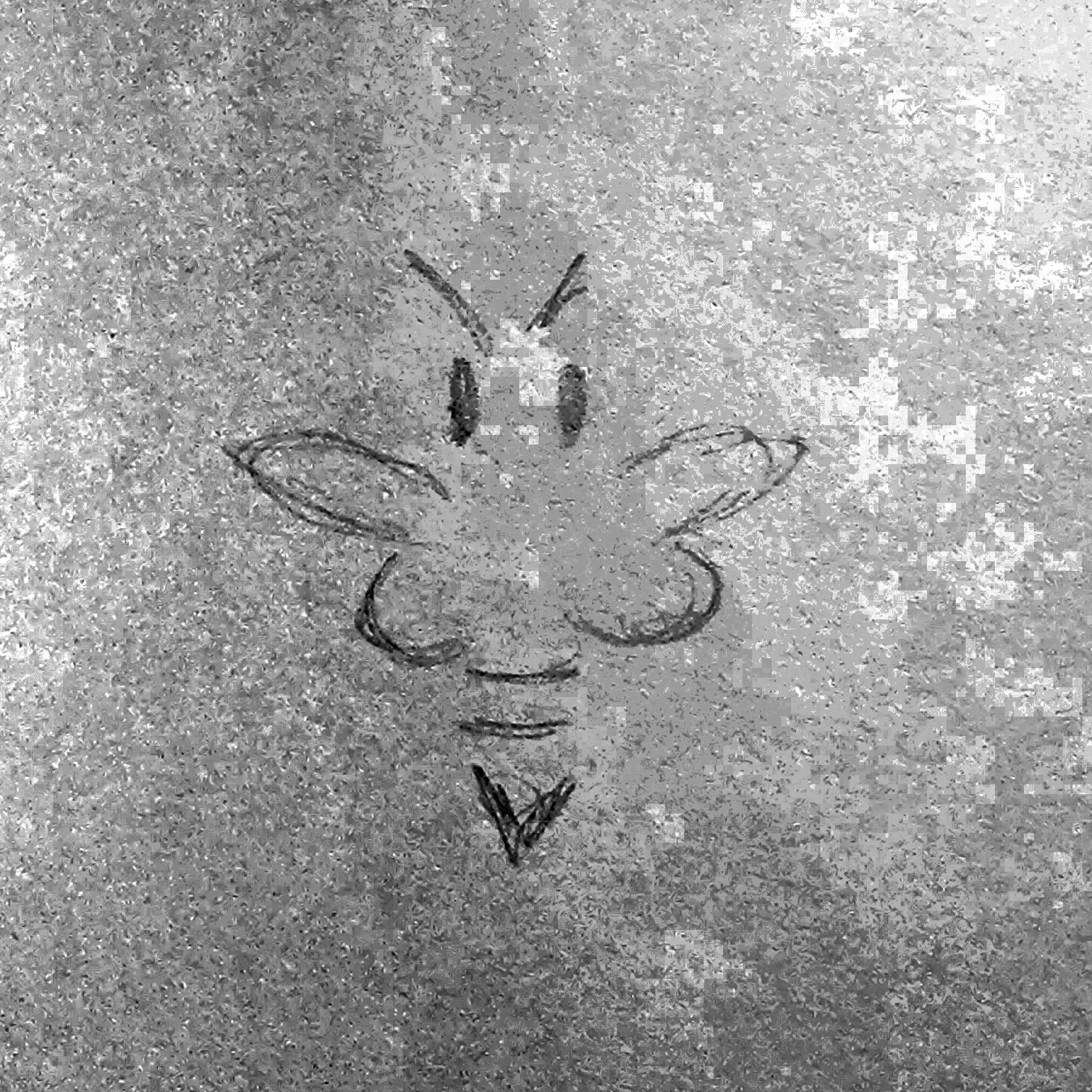
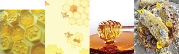
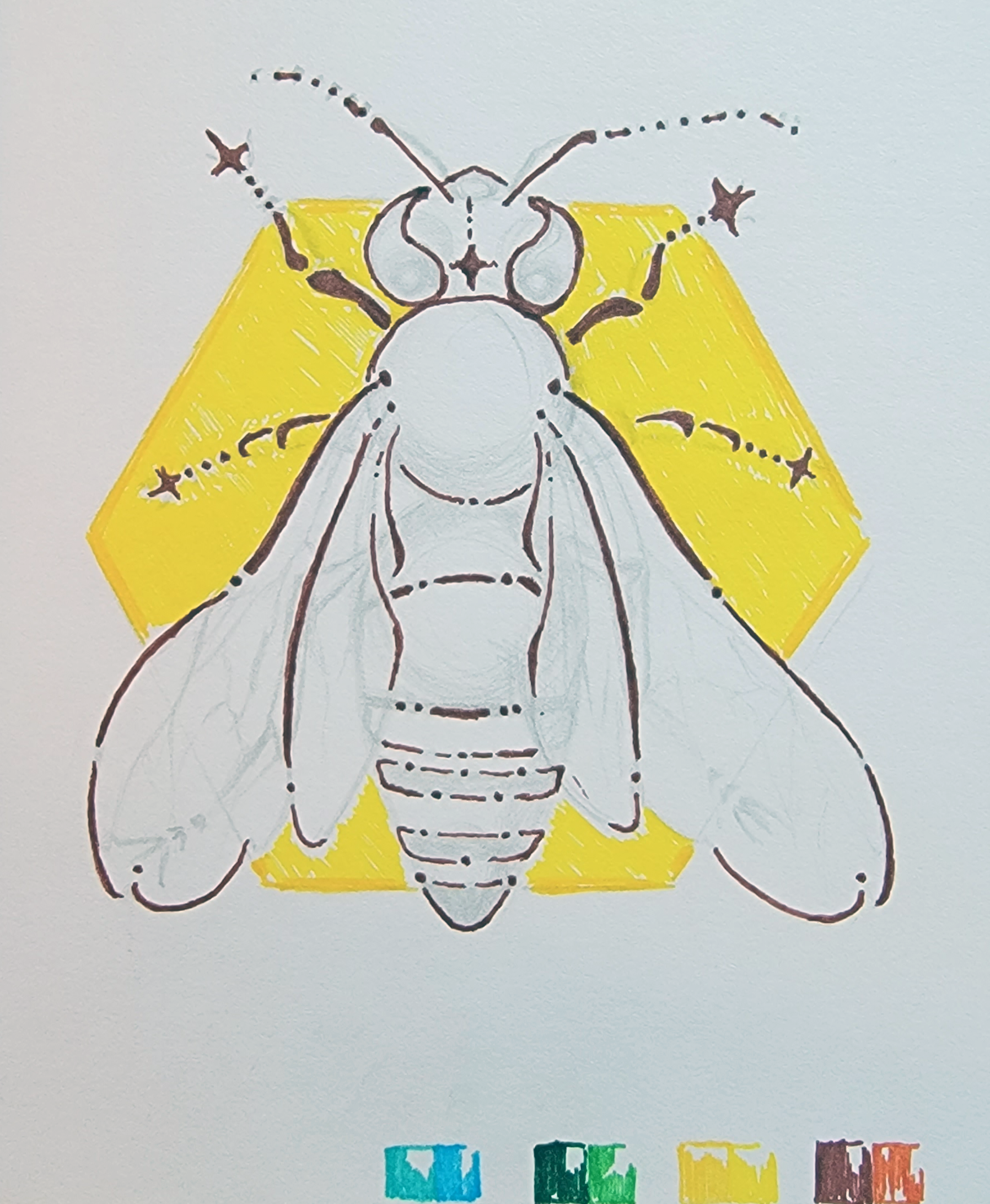
The name Honeybee comes from studying Color: The Secret Influence by Cherie and Kenneth R. Fehrman. While studying colour psychology and physiology I came across a fact that surprised me. Honeybees see in ultraviolet to be able to see which flowers have more pollen, helping them decide where to land. And this is what I wanted Honeybee to represent, a study on how to come to decisions more easily.
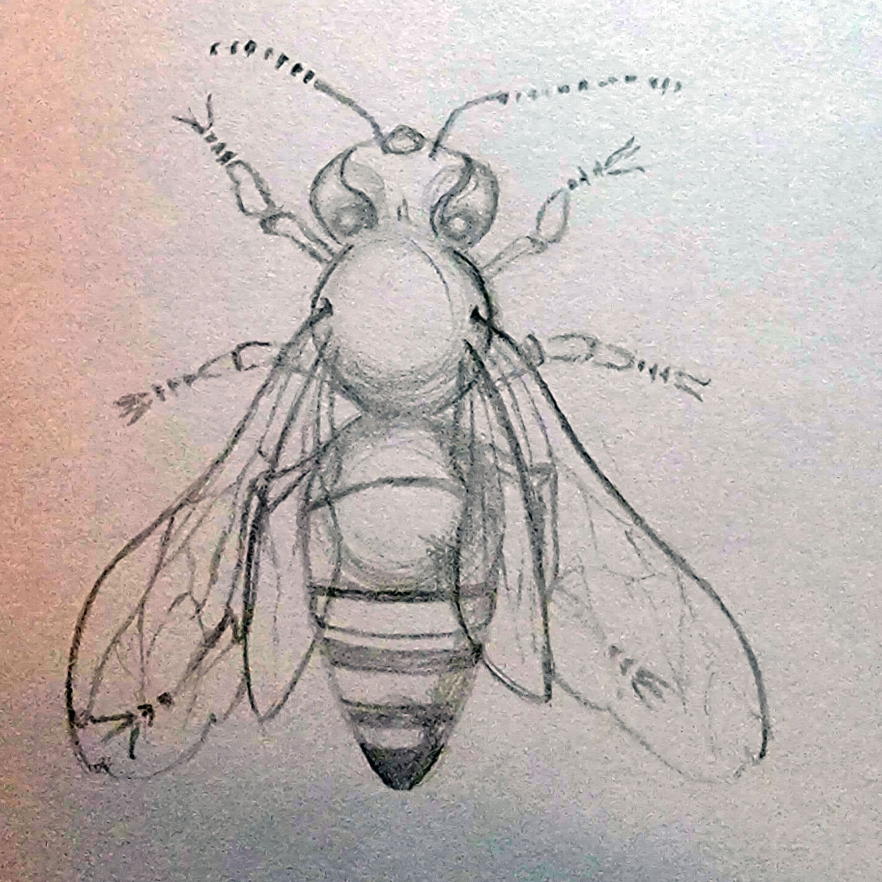
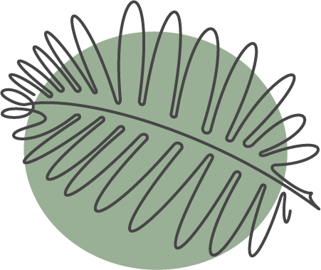
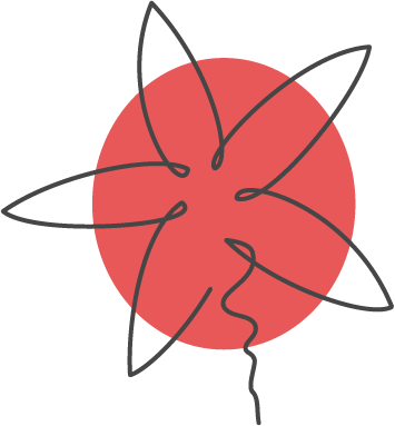
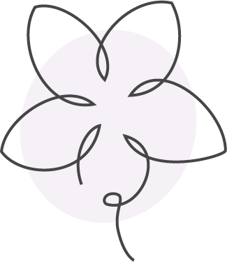
As Honeybee is meant to be an open and cheerful brand, so the influence came from a bohemian style with single line drawings with shapes filled with solid colour. I wanted to tie in elements of honeycombs with the abstract shapes to continue the connection to the bees.
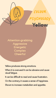
Colour theory landed a large role in the concept of this project. so I took some time realizing which colours we absorb the easiest. It came back to be a yellow-green (#79e025) for active eye, such as daytime and blue-green (#2ecec5) for the resting eye, such as at nighttime.
After the preliminary sketches and discovering the colours that are most easily perceived, but the two I discovered as easily absorbed were both on the same tonal level, so I adjusted the colours to better pair with each-other. As well as adding a golden honey colour and a warm brown.
.png)
While choosing the fonts I wanted to have something that resembled the mono-line hand drawn style of the logo.
Palmer lake - script
Logo and titles
Palmer lake - print
Subtitles and headings
Avenir
Body copy and headings
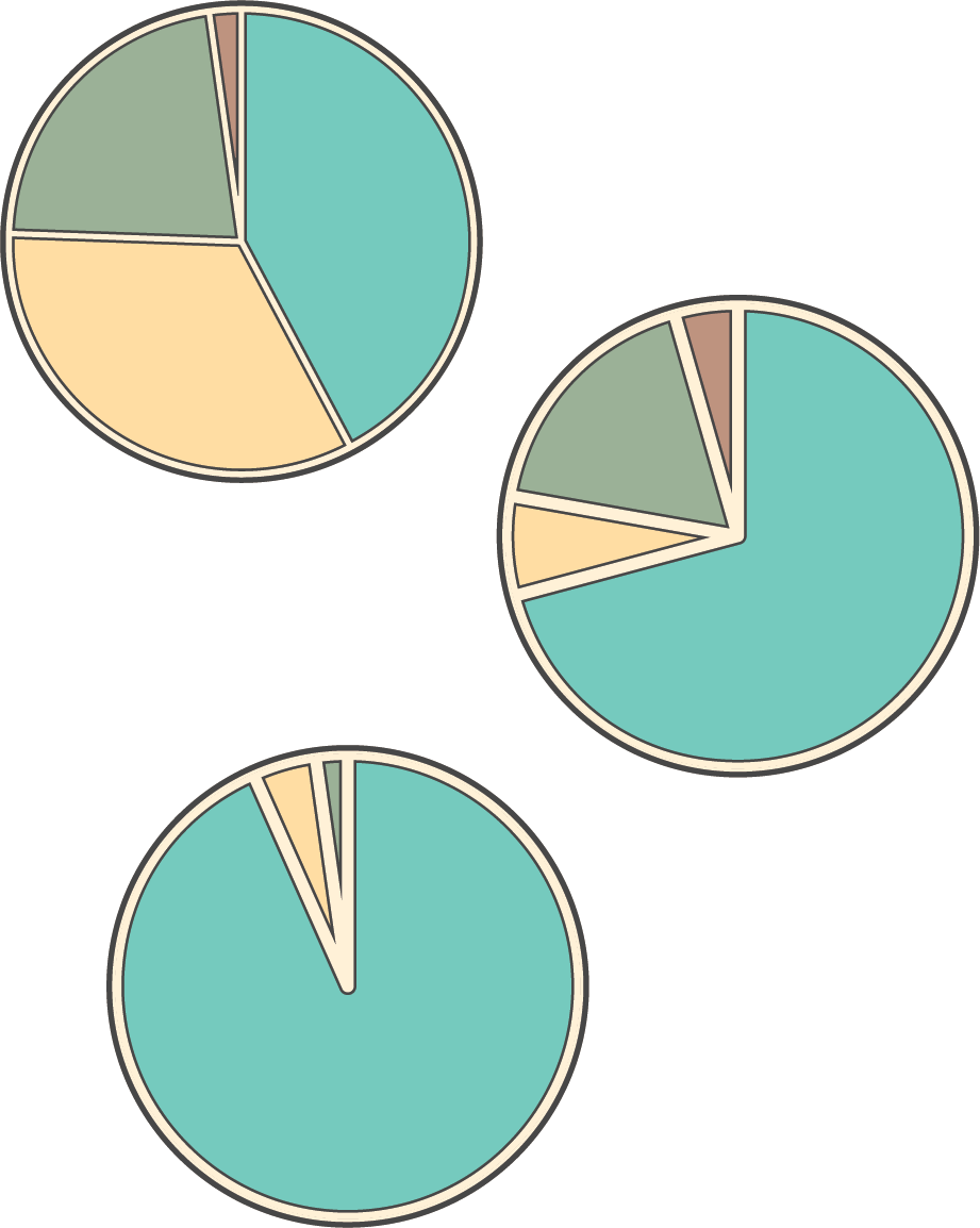
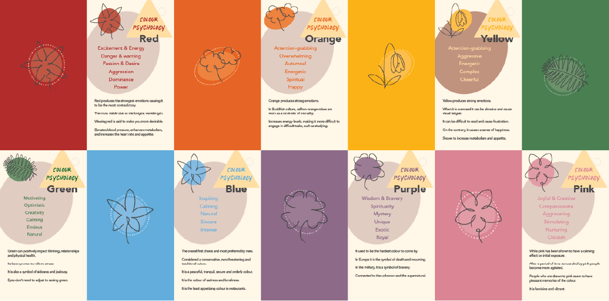
To get proper research for indecision I wanted to ask people my own questions on what they thought stopped them from making decisions. It came back with incredibly interesting results that I wanted to turn into turn into visual infographics to help people understand where their indecision comes from.
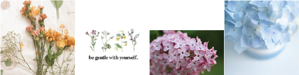
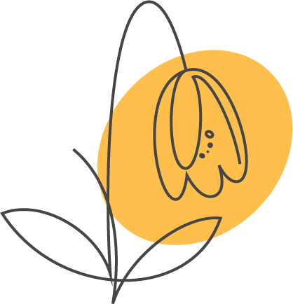
With the previously established idea of using mono-line and solid colours, I wanted to do a series of images and icons in imagery that supported the content in the bohemian style.
Most of my time researching was learning all about what colours mean to us. I discovered that colour not only effects us psychologically, but physiologically as well. There is also cultural and geographic biases to take into play for colour psychology, so there was a lot of conflicting information to sift through. The more I understood about colour I realized how little that os truly known on how colour effects us.
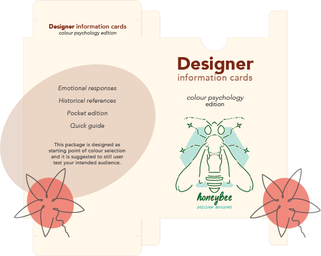
The cards are meant as a starting place for designers when deciding on a style direction. Having them small enough to be accessible on a desk would be important, but I made them the size of tarot cards so that more information could fit on them.
The flowers were first drawn in procreate and then brought into illustrator to clean them up.
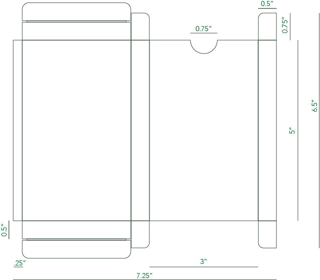
With a deck of cards you would need a place to contain them, especially while on the market. The package itself was rather simple, making the dimensions only marginally bigger than the cards. The depth of the box was a bit too big because it was hard to determine how thick the deck of cards would be.
There is a disclaimer on the box stating this is only a guide and not to only use the colour psychology within the cards without first discovering your target audience and learning what biases that demographic has.
The idea of the colour psychology cards sparked the idea of having an entire line of information cards for designers, including typography tips, art styles and more.
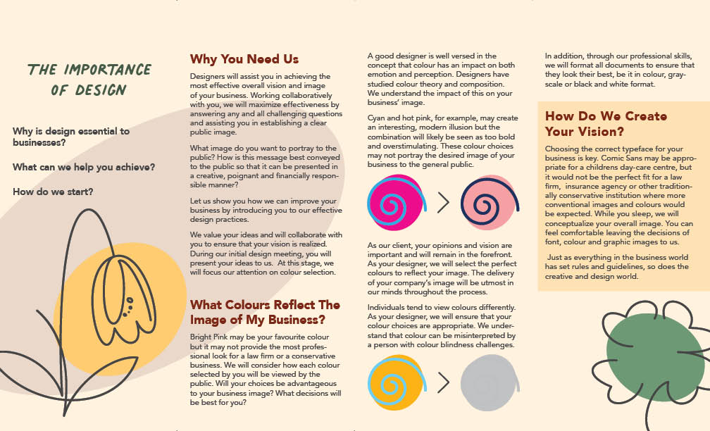
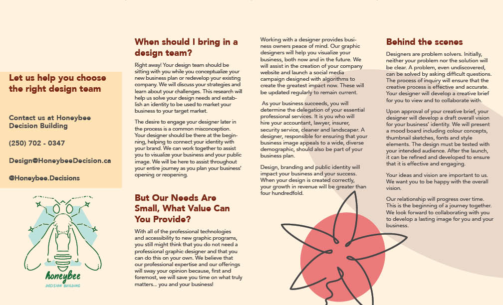
This component is for newly established businesses finding out their next direction. It's about how and when to get a graphic designer on their team and what they would expectantly receive from a quality designer.
Within the pamphlet it explains why we might change the design from what you have intended and show you how people may view your design. This includes touching on colourblindness and black and white printers, things most people don't think about.
There is also contact information for Honeybee to get people in need of designers connected.
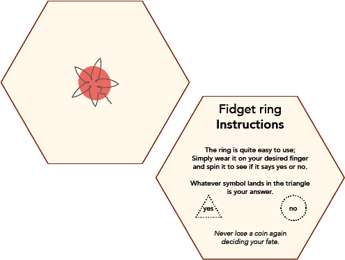
When the survey was complete there was a large number of people that stated they use fidget devises, lists or tools to help them come to a decision. This gave me the idea to combine a fidget tool with something that could help make decisions.
Fidget rings are far from a new idea, but what if it could have the same purpose as flipping a coin?
With the idea in mind, it was actually a lot harder to execute than I thought it was going to be. The initial idea was to create it in a 3D modelling program but there was too much going on to learn a new program at this moment. The next idea was to get the ring 3D printed, but no printer would get back to me about the idea.
Finally, I discovered there was a Photoshop mockup that I was able to start with. I designed the symbols and the triangle identifier.
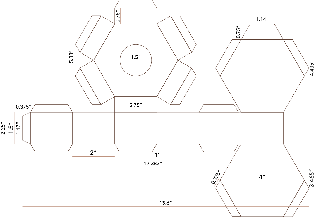
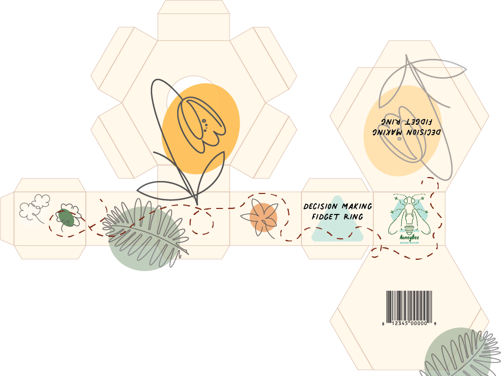
The last design component to the Honeybee project is the box for the ring. This box was a lot more complex than the cards packaging because I wanted the box to represent a honeycomb.
There wasn't any examples that I could find of exactly how the box I wanted, so I used the idea of a couple to plan out my own.
Once I got the sides of the hexagons right the rest of the dimensions fell into place. It was tricky to find out where the tabs that would be glued would go but staggering them along each side seemed ideal.
With a unique ring I wanted there to be instructions so people understand what they are meant to do with the ring. It's a whimsical tool meant to be used like a coin or a magic-8 ball. The instructions were meant to be a light-hearted way of telling you what each symbol is recommended to represent.
The outside of the box was to have the same style as all the other components, but with the box the challenge came down to matching the designs on each corner that it overlapped with another side.
Assembling the box was quite difficult as I hadn't taken into account that each of the flat parts that wrapped around the hexagons would need to be slightly longer than the component in the middle. It eventually worked with a real tight squeeze while gluing.
Overall the box came out better than expected before it was assembled.
Learning all about indecision and colour theory was an extraordinary experience. There was several times that the subject took me down a rabbit-hole that turned out to be irrelevant but still incredibly interesting concepts.
I can tell that I have only scratched the surface of an incredibly deep subject branching into accessibility, mental health and overall confidence. I am very proud of what I was able to accomplish in 3 months and ideally I will continue to come back to this project and expand on it in the future.
Choosing this concept because I didn't know where the solution would take me turned this into a thrilling outcome that I did not have the knowledge or skills to complete before I started.
Overall, my greatest success was keeping a detailed journal to not only keep me on track but it was filled with enough notes that I could see where I most successful and what ideas had to go. This really helped with this case study, to be able to go back into the cataloged information and remember my thought process.
Books
Internet sources
Research summary